Holistic Wellness
Supporting women on their wellness journeys by providing online holistic wellness and mental health services
Introduction—
Holistic Wellness by Keisha is a B2C company that provides online resources and virtual lessons to new mothers as they enter into motherhood. Keisha, the founder, is a Holistic Health Coach and a Licensed Clinical Social Worker. She hopes to aid her clients by finding a balance between the Mind, Body, Spirit and Motherhood.
Process—
Discovery + Research
Ideation
Design
Prototype
Dev Handoff + Reflections
Role—
UX/UI Designer
Team of 6
Tools—
Figma
Miro
Zoom
Problem—
Our client came to us looking to improve the overall functionality and flow of her mock website. She found that her website struggled with lengthy pages, excessive scrolling and an unclear navigation, which directly affected her client base and the performance of her services.
Keisha also wanted our team to ensure her website reflected her brand attributes (empowering, safe and supportive) as her users currently struggle with understanding who she is and what she does.
Solution—
Our team focused on a website redesign that accurately markets Keisha’s 3 services while offering:
Visual hierarchy, aiding in content consumption
Clear CTAs, prompting users to take action and engage with her services
An attractive interface, translating brand identity to user experience
Duration—
5 weeks
01 Discovery + Research
1.1— Kick-Off Meeting
My team and I devised a call to review the project plan, identify roles and responsibilities and coordinate timelines. We also laid out questions to ask the client to further define success for this project. Several of these questions can be found on the right.
I learned that the client wants a website that is easy to navigate and not aesthetically busy. Extra attention needs to be geared towards the main page and the information request/contact page.
1.2— Competitive Analysis
While conducting secondary research, I came across competing websites that were similar to Keisha’s mission. I evaluated the three competitors, finding their strengths and weaknesses to help me recognize opportunities for Holistic Wellness by Keisha.
I learned that it is important to have a balance between functionality and aesthetics. Our team needed to focus on organization and clean design without compromising Keisha’s personality and branding. Utilizing multiple CTAs will also play a big role in maximizing user engagement.
1.3— User Stories
My team and I identified 6 user stories to provide us with an important, realistic view on what our user’s end goals are. They were then used to inspire our design decisions.
As a user, I want to:
Learn more about Holistic Wellness and its mission.
See all the services Holistic Wellness has to offer.
Request more information about the service I’m interested in.
See whether insurance is provided or not.
Submit a request to get in contact with the Holistic Wellness team.
02 Ideation
2.1— User Flows
Using our user stories, we created the following 3 user flows to better understand how users will navigate the website. They gave our team and stakeholders a better understanding of the user experience architecture.
As a user, I want to learn more about Holistic Wellness and its mission.
As a user, I want to see all the services Holistic Wellness has to offer and request more information about the service I’m interested in.
As a user, I want to submit a request to get in contact with the Holistic Wellness team.
2.2— Wireframes
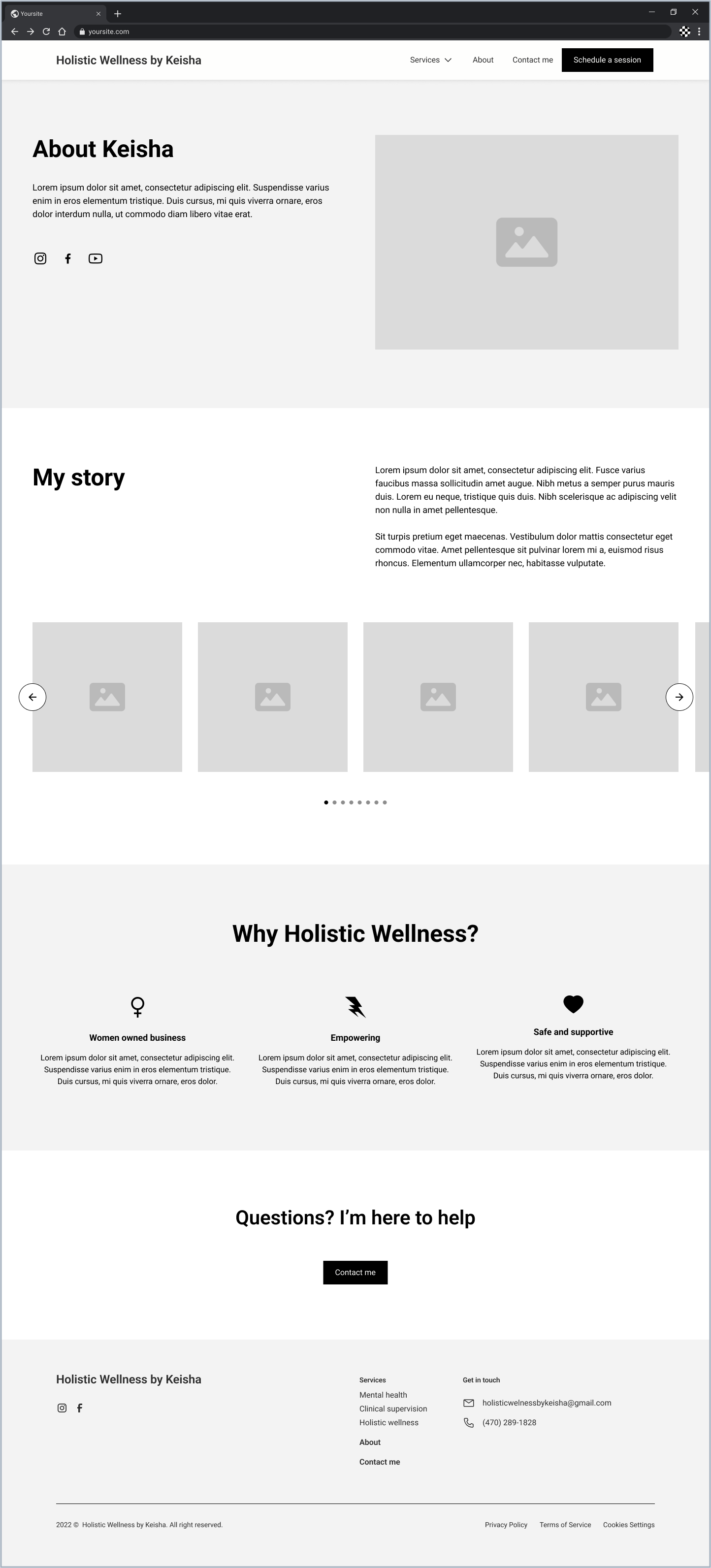
My team and I split up into groups of 2 to tackle our mid-fidelity wireframes. I was assigned the homepage and took inspiration from Headway, Better Help and Noyo to come up with a clean and intuitive screen.
As a team, we ensured open communication and checked in with one another so that our designs remained consistent and clean. This involved discussing important elements, such as an 8 point grid system or stroked icons.



2.3— Client Feedback
We walked our client, Keisha, through the state of our wireframes to ensure clear communication throughout our process. Once we received the following feedback, we iterated and were granted approval from Keisha to continue forward.
Catered the homepage’s layout and branding towards Holistic Wellness, as she wanted to emphasize and accommodate to her clientele who need this service
Adjusted CTAs to lead to her Headway account, where her clients and schedule a session
Added specific information regarding her insurance and services that she wanted her users to be aware of
03 Design
3.1— Mood Board
I wanted Holistic Wellness by Keisha to emulate Keisha’s 3 brand attributes: empowering, safe and supportive. Her website is primarily intended to be a safe space for women who need guidance, so we looked to interfaces that are approachable and functional.
3.2— Style Guide
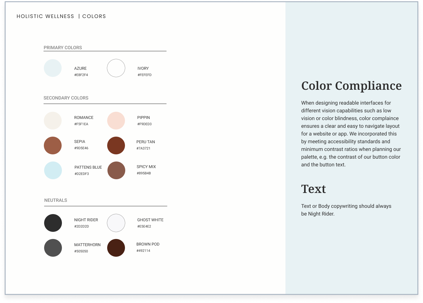
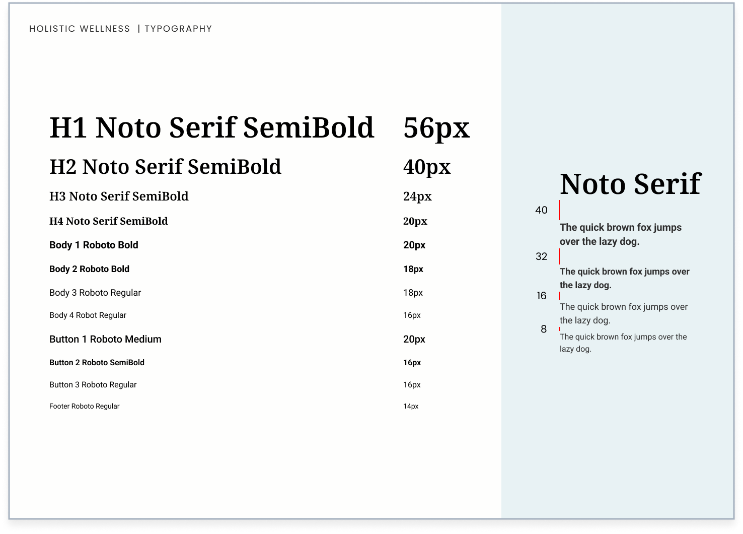
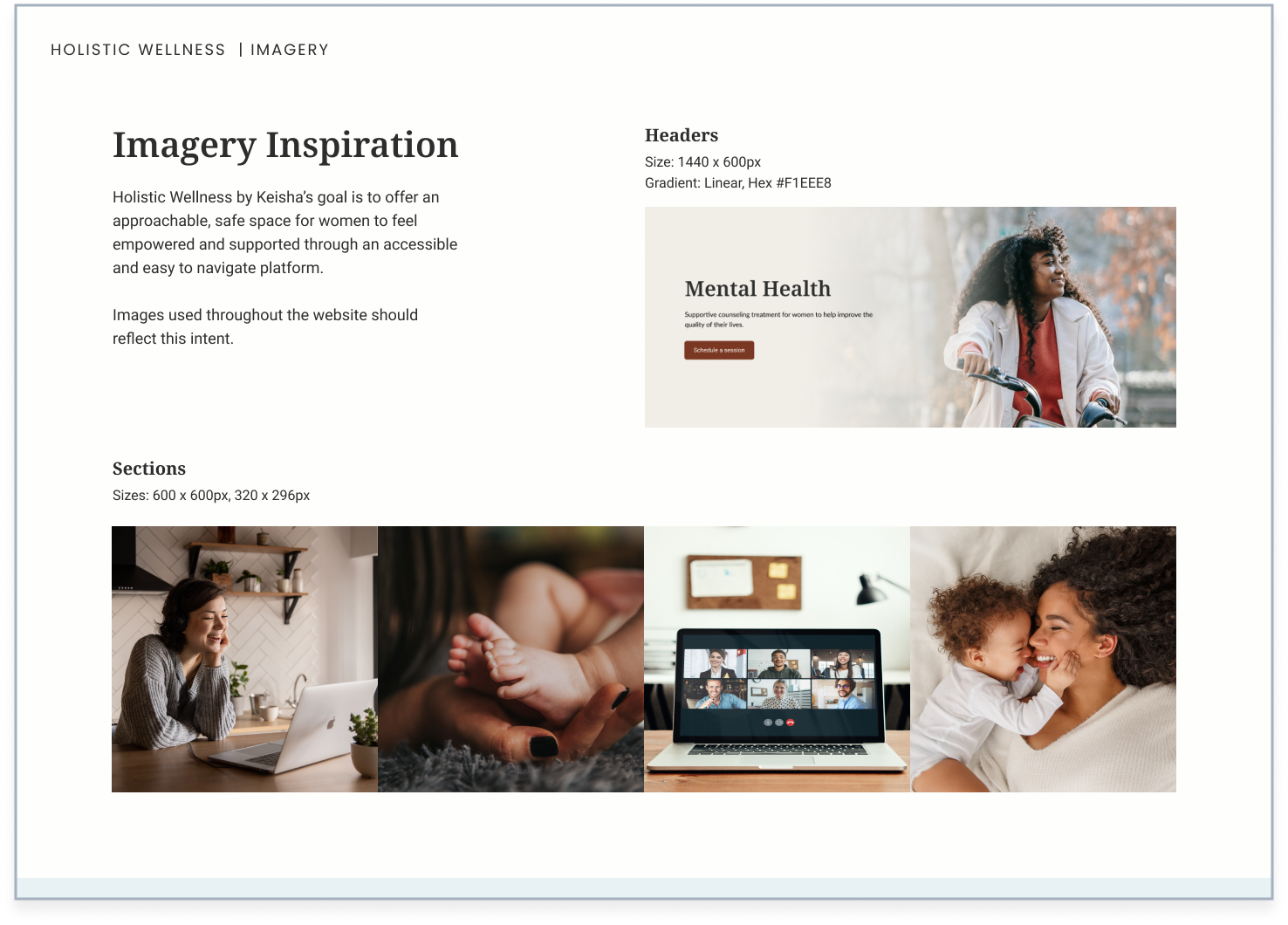
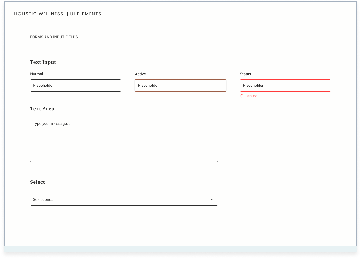
Our style guide served as a central reference point for all of our design decisions, keeping everyone on the team consistent and on the same page as we moved from wireframes to high-fidelity screens. During the process of iterating our designs, I continually updated the style guide to reflect these changes.




3.3— UI Iterations
My team and I set out to create four iterations of the homepage. We wanted to present Keisha with varying styles of font, background elements, illustrations, shapes and imagery.
I particularly wanted to hone in on white space design, which is how I created Version 1 on the left. I wanted to balance the user while still offering warmth, calmness and personality with the use of blue, earthy tones and waves as background elements.
“I decided on the first concept (UI Iteration 1). I love the clean white space design as it provides a nice professional balance… The 3 service cards are spot on for what I wanted to share with users. I like the color tones that were provided… Overall, UI Iteration 1 is very much in line with my vision.”
Keisha Carter Brown, Client
3.4— High Fidelity
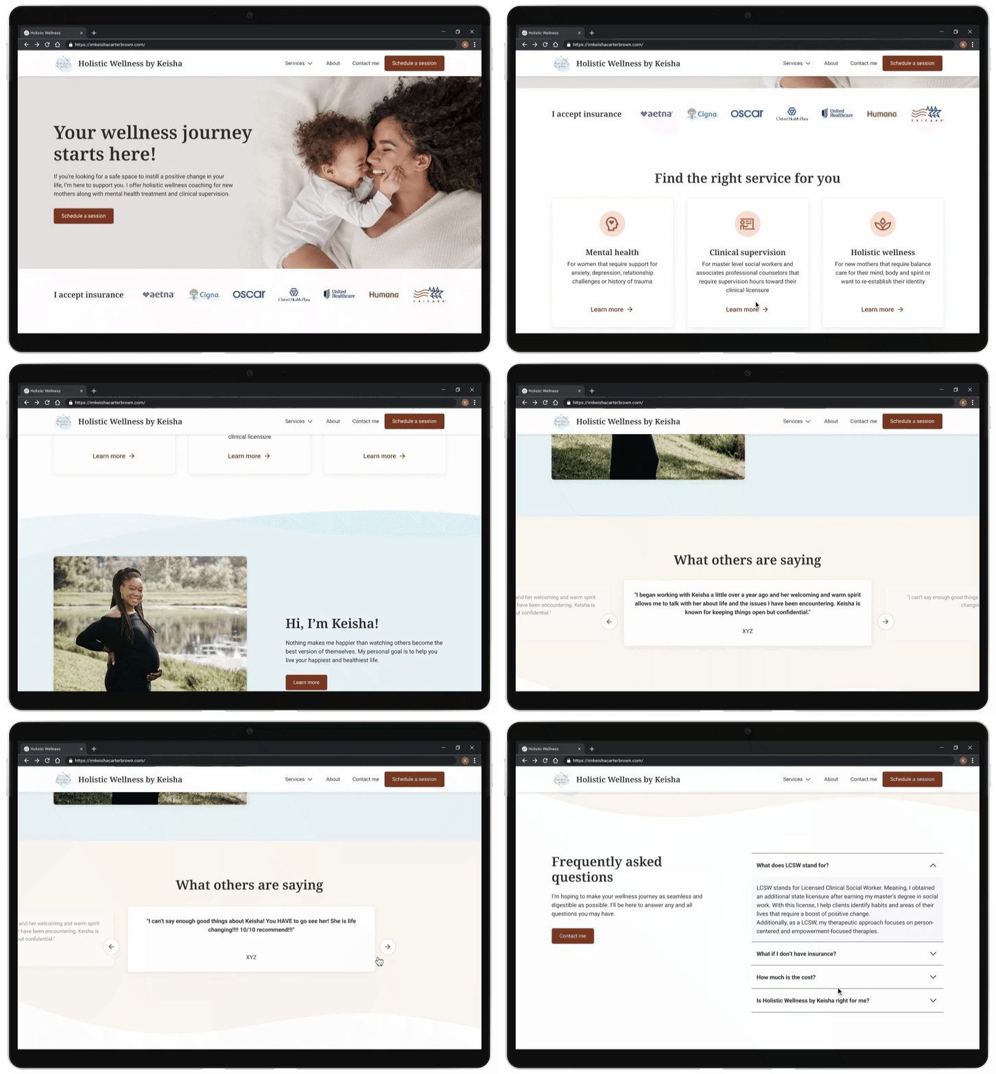
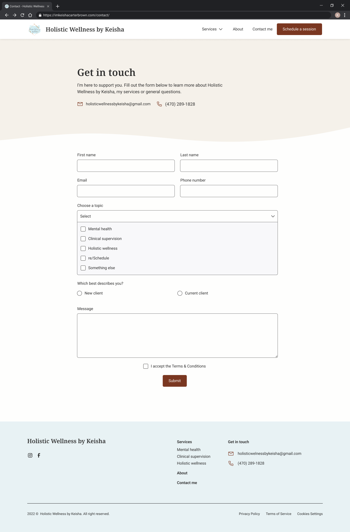
Using this approved iteration, we applied the style to all of our screens to reach a clean, white space design. Like our wireframes, we teamed up to tackle this deliverable. I was assigned the homepage and contact page, and I ensured an interface that met Keisha’s standards of creating an approachable space for women and new mothers.


04 Prototype
Heading into our prototyping phase, our team focused on elements such as micro-interactions, smooth animations and button states. We wanted to successfully show Keisha how the final product would look and function. I personally worked on the carousel for client reviews and continuously checked our user flows to spot any missing functionality.
05 Dev Handoff + Reflections
5.1— Dev Handoff
I prepared annotations for the homepage and contact page to accurately represent our ideas and designs and to save time and effort for the developer.
My team and I focused on the user flow of our designs, adding arrows to give context to the relationship between different screens and components. We also included measurements on padding and spacing, described how interactive elements and animations function and annotated the different states of our UI components.
5.2— Reflections
It was rewarding to work on a project in the health and wellness space that supports mothers who need resources. I value UX Design because it has the ability to empower users and their stories. Holistic healthcare, mental health and motherhood are all areas not addressed enough, so I loved being a part of this project that pushes for these services in the digital space.
I learned to trust the process in this project. Designs will come together as you continue to listen to feedback and implement improvements. This project allowed me to push my designs further through subtle design decisions, such as exploring vector elements, cards and carousels.


