Reinventing the way women think, feel and approach beauty by encouraging informed decisions on their hair care purchases
Introduction—
HairQare is a B2C company that helps women achieve their beauty goals through personalized health and wellness routines. HairQare is a believer of truthful, science-backed beauty education, and they currently serve over 40,000 customers globally.
Process—
Discovery + Research
Ideation
Design
Prototype
Dev Handoff + Reflections
Role—
UX/UI Designer
Team of 6
Tools—
Figma
FigJam
Miro
Zoom
Problem—
Our client recently launched an MVP web app that allows consumers a way to identify potential toxic ingredients in their hair care products. However, usability testing and user interviews revealed friction in the application’s information architecture. The content presented to users was very valuable yet overwhelming, difficult to navigate and lacking content hierarchy.
The client wanted us to address the users’ pain points while staying true to HairQare’s brand and mission.
Solution—
The goal of this project is to translate the client’s current MVP into a mobile app, focusing on the scanner feature and delivery of information, to make the content more accessible and digestible.
An onboarding, log in and sign up system to personalize a user’s experience
A scanner feature where users can scan multiple products
A profile page that allows users to learn about their unique hair
Duration—
5 weeks
01 Discovery + Research
1.1— Kick-Off Meeting
My team and I met via Zoom to review our deliverables, discuss the app’s key features and review their research findings. We also laid out questions to ask the client to further define success for this project.
From these questions, I learned that the client wanted an app that is easy to navigate and supports the user throughout their hair care journey. Extra attention needed to be geared towards the scanner output and interactivity to engage users.
1.2— Secondary Research
In order to better grasp the problem at hand, I conducted research on the hair care industry and found that consumers are becoming more eco-conscious and open to learning about harmful ingredients.
Industry Driving Factors:
Increasing hair related issues to aid market growth
Increasing focus on development of organic and natural products to surge demand
Industry Trends:
Adopting do-it-yourself (DIY) beauty care, such as DIY hair coloring, post the COVID-19 pandemic
Increasing celebrity endorsements
Rising awareness on harmful chemicals and products, leading to the demand for natural, organic and vegan hair care
1.3— Competitive Analysis
To better familiarize myself with the hair care industry and product scanners, I looked to 3 mobile apps with competing mission statements and motivations as HairQare.
After evaluating these competitors, I determined areas of opportunities to implement into HairQare. They have the chance to drive the market forward by balancing between being a personalized experience and an informative, education-driven product. Additional opportunities for a successful user experience involved designing a simplistic and transparent app.
02 Ideation
2.1— User Flows
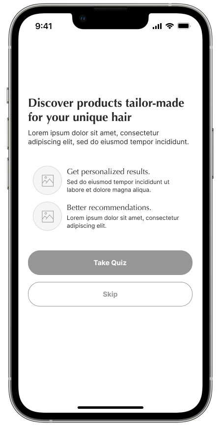
We focused on the following user stories and translated them into 4 flows to better understand how users will navigate the app. I led the design of User Flow 1, involving the sign up and onboarding processes.
As a user, I want to create an account with HairQare.
As a user, I want to log in to my HairQare account.
As a user, I want to see my profile and learn more about my unique hair profile.
As a user, I want to use the hair care product scanner to learn more about my hair type and what products I should be using.
2.2— Wireframes
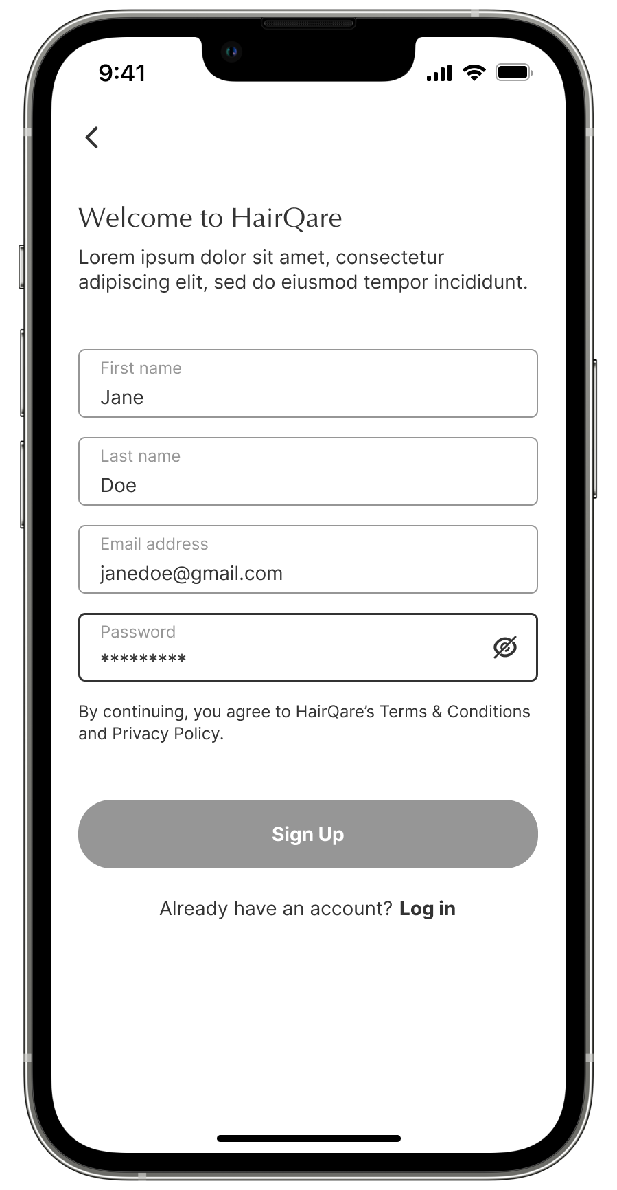
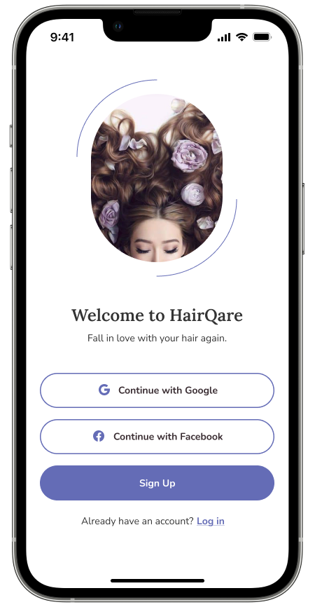
My team and I assigned screens to each member to tackle our low-fidelity wireframes. I worked on User Flows 1 and 2 involving the login and sign up processes. I focused on allowing sign up with social media accounts for one-click registration, providing instant input validation and allowing switching between login and sign up.
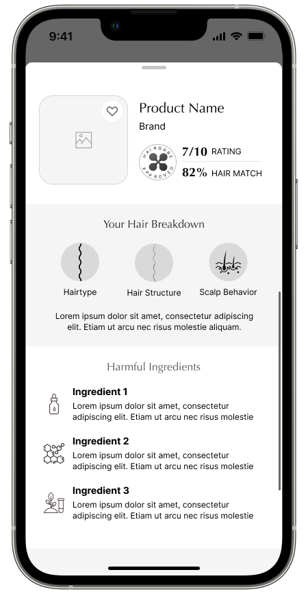
After completing my wireframes, I helped a teammate on the product scanner screens. Together, we came up with a layout that properly breaks down the necessary information a user needs in order to make a purchase decision.





2.3— Client Feedback
After we presented our client with the state of our wireframes, they came to us with changes in their product concept and ideas. They wanted a shift towards wellness and habits to increase user activity. With customer retention in mind, our team adapted to these changes and conducted effective design sprints to implement the following:
Develop a daily log and calendar tracking to encourage users to use the app regularly
Increase user personalizations
Greater use of infographics to break up text
03 Design
3.2— Mood Board
Our team wanted to accurately reflect HairQare’s brand attributes: engaging, simple and helpful. For inspiration, we looked for organic, clean images and modern influences that matched their target audience.
I specifically looked into platforms that position their brand as female-first and who authentically message supporting confidence outside and within. I was also inspired by apps I use in my daily life that echo HairQare’s vision. This included the mobile apps Flo, Headspace and Co—Star.
3.1— UI Iterations
Each team member created an iteration of the scanner feature to present our client with varying styles of font, color, layout, etc. I offered the following design elements in my version to ensure simplicity and usability:
A new font pairing, ‘Lora’ heading and ‘Nunito’ body text, for a modern, readable and balanced experience
‘Pull up’ and ‘pull down’ text affordances to aid the modal toggle
Action items (Favorite, Share and Review) at the top of the scanner output to encourage users to interact with other app features
Chart colors that correspond with semantic color coding
A barcode vector for visual affordance to guide users as they use the scanner
Blue, clickable components for more information as visibility cues
3.3— Client Feedback
We reviewed each member’s iteration and presented them to our client. After 2 more rounds of iterations, we landed at a design that integrated the likes of the client from each. We validated and refined our designs according to HairQare’s expectations for a successful product. The following changes were implemented:
Removed icons that promoted any marketing to ensure independency from brand influences
Implemented a new product rating scale
Improved the functionality of warning modals to be more informative with collapsible, additional information
Adjusted the flow of the scanner feature’s toggle to display information up front
3.4— Style Guide
Our client did not have an existing or working style guide, so we had the chance to document HairQare’s brand and our designs in our own way. We hoped to bring in a modern and simple design to reflect the company’s brand.
Our style guide brought cohesion to our user interface and experience and to our team as well. I continually made updates after iterations, and I made sure we recorded all crucial design elements and UI components such as color, typography, buttons, etc.
3.5— High Fidelity
Once we finalized our UI design and style guide, we applied them to each of our screens by conducting design sprints and teaming up to tackle this deliverable. I focused on the home page and scanner screens, and I ensured a simple, approachable interface and space for women to start their hare care journey.


04 Prototype
With the green light from our client, we moved into our prototyping phase and brought HairQare to life. Special attention was made towards micro-interactions and scrolling, pulling together our user flows and app features.
I primarily worked on the scanner, where I added the toggle in the bottom sheet, or scanner output. I also prototyped the navigation bar to anchor the bottom and access their assigned screens. From there, I gladly offered assistance to my teammates in other areas of the prototype to reach our end product below.
05 Dev Handoff + Reflections
5.1— Dev Handoff
The final stage of our process involved preparing our designs for the developer, so it can be implemented in code. My team and I provided measurements and annotations via Figma’s ‘Measure’ and “Annotate it!’ plugins. We split up the screens, communicating constantly and ensuring consistency throughout.
I focused on explaining each design decision I made and detailing the functionality and behavior of how the app should work. We made sure all of our designs were presented neatly, organizing and labeling everything clearly. Overall, my team and I made sure to be thorough, as a good designer-developer collaboration is vital.
5.2— Reflections
I stand by HairQare’s mission to empower women to be “in control of how they feel about themselves,” as it aligns with my own personal and career goals. I had the honor of working on this project with such talented designers and a respectable client.
Throughout this process, I learned how to gracefully control situations with quick turnaround and unexpected changes to the project plan. With tight deadlines, I was able to help keep my team and I focused to maintain a streamlined process.
Our team became comfortable with presenting and defending our design decisions to the client and stakeholders when necessary. Overall, with strong communication and open-mindedness, we were able to accomplish an app that met our client’s needs and expectations.


